Concept | Branding | UX Design
Urban Pantry Mobile App
A streamlined grocery experience engineered to eliminate the mental load of domestic logistics through intuitive wayfinding and automated organization.
The Challenge: Solving for the "Mental Load"
Modern professionals managing both high-stakes careers and demanding households face a constant ‘mental load’ when it comes to domestic logistics. Traditional grocery tools often add complexity rather than removing it, leading to wasted time, organizational fatigue, and a fragmented shopping experience that fails to account for a packed schedule.

The Objective: Optimizing Time & Cognitive Energy
Our goal was to transform grocery shopping from a chore into a seamless, automated workflow. By prioritizing a mobile-first philosophy and intuitive navigation, we aim to reduce the time spent in-store and online, returning valuable mental energy and time to the user through a refined, easy-to-navigate digital environment.

The Strategy: A Framework for
User-Centered Innovation
Our methodology was built on a rigorous User-Centered Design (UCD) framework, prioritizing empathy and strategic data over assumptions. We began by conducting deep-dive user research and stakeholder interviews to define the target persona and map the architectural user journey.
By establishing clear research goals early, we transitioned into the structural phase, developing project storyboards and a robust Information Architecture through iterative wireframing. This allowed us to validate the core logic with low-fidelity prototypes before moving into high-fidelity design. The final execution involved a comprehensive design system and rigorous usability testing to ensure the ‘Urban Pantry’ experience was not just visually polished, but operationally seamless.
Insight & Definition
Conducting deep dive interviews and persona mapping to align the product with the user’s mental load.
Information Architecture
Engineering the site map and wireframes to ensure a seamless, high-conversion user journey.
Visual Systems & Testing
Developing high-fidelity mockups and rigorous usability testing for a polished, professional grade result.
Understanding the User:
Data-Driven Insights
Our initial research hypothesis assumed that cost-savings would be the primary driver of user satisfaction. However, deep-dive user interviews revealed a more critical friction point: The Cognitive Load of In-Store Navigation. While budget is a factor, the data showed that ‘store-switching’ and unpredictable layouts were the leading causes of user frustration and decision fatigue. This insight shifted our focus from a simple coupon tool to a strategic navigation and organization system.
“I hate when they switch around the store. You have to maze through everything to find what you need.”
-Research Participant
1. Inefficient Wayfinding
Users lose significant time navigating unpredictable store layouts, turning a routine task into a high-stress “maze.”
2. Meal Planning Friction
The mental burden of deciding what to cook leads to forgotten essentials and a fragmented, disorganized shopping process.
3. Disconnected Logistics
Shopping lists that aren’t synced with pantry stock or meal plans result in redundant trips and wasted time.Shopping lists that aren’t synced with pantry stock or meal plans result in redundant trips and wasted time.
4. The Impulse Spend
A lack of structured list-building leads to budget overruns and food waste as users default to “visual shopping” rather than intentional purchases.
The Target Persona:
Meet Naleem
A 35-year-old educator with a Master’s degree, managing the high-stakes demands of a teaching career alongside the logistical requirements of a young family. Naleem is the quintessential “Busy Professional” seeking optimized systems to reclaim her time.

Age: 35
Education: Master’s Degree in Education
Hometown: Champagne, Illinois
Family: Married, one young child
Occupation: Teacher
“I really appreciate products that help me stay more organized and save me time in my busy schedule.”
The Motivators
Time Sovereignty: Reclaiming hours spent on domestic logistics to focus on work-life balance.
Cognitive Ease: Reducing the mental clutter of meal prep and pantry management.
Operational Efficiency: Finding tools that integrate into her schedule, rather than complicating it.
The Problem Statement
Naleem is a busy professional and mother who needs a streamlined, intuitive way to manage grocery logistics because the current fragmented process of meal planning and in-store navigation is causing significant decision fatigue and time loss.
The Core Friction: Her existing tools are disconnected from the physical reality of the store layout, leading to an inefficient, stressful experience that encroaches on her limited personal time.
Competitive Audit: Identifying Market Gaps
To understand the digital landscape of grocery logistics, we performed a comparative audit of both direct and indirect competitors. We mapped the user journey across existing mobile interfaces to identify what was working and where the industry was failing to serve the ‘Busy Professional’ persona.
Market Strengths
Intuitive Pickup Flows: Streamlined, “click-to-collect” functionality.
Accessibility: Clean, high-contrast interfaces that prioritize readability.
Simplified UI: Minimalist aesthetics that reduce visual clutter during the shopping process.
Opportunities for Innovation
Navigation & Wayfinding: Most competitors lack internal store mapping, forcing users to “maze” through aisles.
Strategic Organization: A lack of integration between meal planning, inventory management, and list building.
Visual Hygiene: Overloaded interfaces plagued by aggressive banner ads and unreadable promotional flyers that distract from the task at hand.
The Solution:
Optimizing Navigation through Intentional Design
With a clear understanding of the ‘mental load’ and in-store friction points faced by our users, we shifted our focus from research to architecture. Our design objective was to strip away the clutter of traditional grocery interfaces and replace it with a high-performance system that prioritizes utility and user-intent. By integrating aisle-based sorting and automated list management, we moved beyond simple digitization to create a truly strategic tool for daily household logistics.
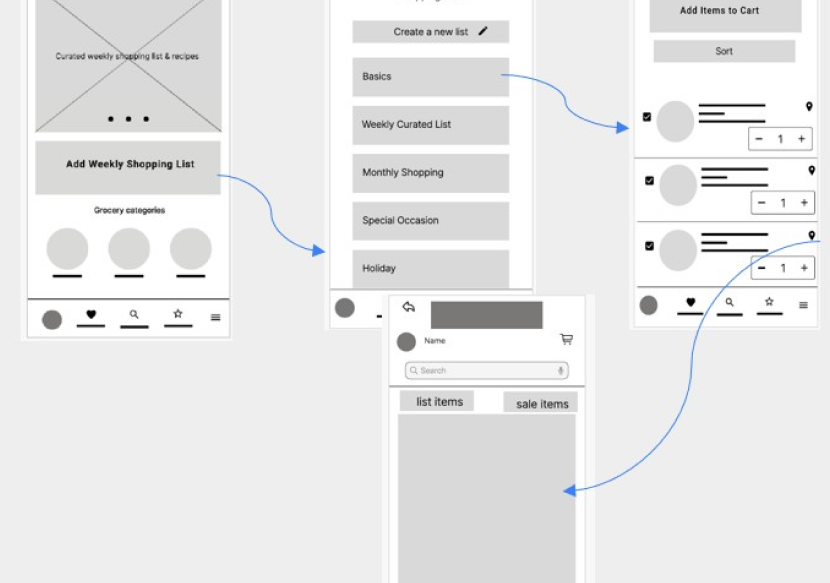
Conceptualization: Paper Wireframes & Storyboarding
Our initial wireframing phase was fundamentally about problem-solving. We utilized storyboards and rapid paper prototyping to map the core user flow, specifically the creation of a new grocery list. The goal was to ensure that the user’s primary pain points (navigation and organization) were addressed at the structural level before any design assets were applied.
Digital Wireframes:
Engineering the Logic
Once the structural flow was validated, we transitioned to high-fidelity digital wireframes. The focal point of this phase was the Aisle-Sort Mechanism. We structured every product card to display its specific aisle number, allowing users to reorder their lists to match the store’s physical layout, effectively eliminating the ‘maze’ problem for the user.
AISLE-BASED OPTIMIZATION
Automated sorting by aisle number to streamline the physical shopping path and reduce cognitive load.
FRICTIONLESS DISCOVERY
Integrated aisle and section IDs for every product, removing the guesswork and effort of locating items.
Spatial Navigation &
Interactive Wayfinding
To eliminate in-store friction, we engineered a visual wayfinding system that bridges the gap between a digital list and physical retail space. By selecting items within their list, users can trigger a real-time, high-contrast store map that highlights precise product locations. This interactive integration caters to spatial learners and provides immediate context for the relative distance between items, transforming a fragmented search into a streamlined, high-efficiency shopping path.
INTERACTIVE SPATIAL WAYFINDING
A dynamic in-app map that visualizes the precise real-time location of products, transforming the shopping path into a high-efficiency workflow.
ON-DEMAND VISUALIZATION
User-initiated mapping triggers that provide precise location data only when required, maintaining a clean and intentional UI.
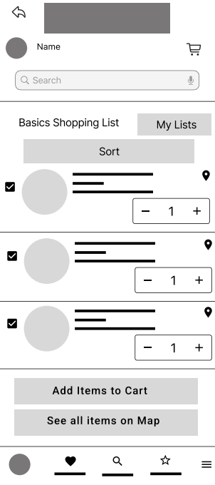
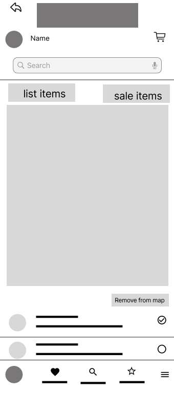
The User Journey: From Intent to Execution
To validate the structural logic of Urban Pantry, we mapped a high-efficiency user journey focused on speed and cognitive ease. This low-fidelity prototype illustrates the ‘Happy Path’ of a busy professional, moving from the initial high-level overview to granular, spatial navigation in four strategic steps.
1. Entry & Intent (Homepage)
The journey begins with a minimalist dashboard designed for immediate access to core functions, allowing the user to bypass clutter and enter their active shopping environment.
2. Contextual Overview (Shopping Lists)
The navigation moves to a centralized list management view, providing the user with a clear high-level status of all active and archived grocery logistics.
3. Strategic Detail (Itemized View)
Selecting a list reveals the “Detailed View,” where our aisle-sorting logic is applied, instantly organizing the user’s mental load into a structured, physical path.
4. Spatial Activation (Wayfinding Map)
The final transition occurs via the navigation icon, triggering the interactive map. This closes the loop between digital planning and the physical reality of the store floor.
Validating the Logic:
Usability Study & Findings
To ensure our strategic assumptions met real-world needs, we conducted a targeted usability study. Our primary objective was to measure the efficiency of the navigation systems and determine if the interface truly fulfilled its promise of ‘time sovereignty’ for the user.
Research Objectives & KPI Metrics
We focused on two critical performance indicators:
Task Success Rate: The speed and accuracy of adding items to a dynamic shopping list.
Spatial Recall: The time required for a user to identify a product’s physical location via the integrated map.
Key Research Findings:
We synthesized the user feedback into three core insights. This transparency highlights a commitment to iterative improvement.
1. Homepage Navigation Friction
The Issue: A segment of users experienced “Choice Paralysis” or missed the primary “Add Shopping List” call-to-action on the dashboard.
The Insight: The entry point needed a higher visual hierarchy to guide the user toward their first intent more aggressively.
2. Interaction Design & Visual Hygiene
The Issue: The “Add to Cart” function, initially designed as an overlay on product images, lacked sufficient contrast. Additionally, category pages were perceived as “visually dense.”
The Insight: Minimalist aesthetics must never sacrifice functional clarity. We identified a need to decouple action buttons from imagery to ensure accessibility.
3. Strategic Success: Sorting & Wayfinding
The Finding: The Aisle-Sort and Interactive Map features received a 100% positive response.
The Insight: These features validated our core hypothesis—users find immense value in tools that translate digital data into physical store logic.
Iterative Refinement:
Architecting a High-Intent Dashboard
Our usability study revealed that while the core features were strong, the homepage suffered from ‘information overload,’ which impeded the user’s workflow. We pivoted from a fragmented, category-led structure to a Workflow-First Dashboard, designed to reduce cognitive load and accelerate the path to action.
1: The Evolution of the Homepage
a. From Ambiguity to Action
We identified that the generic “Add Shopping List” button caused hesitation. We replaced it with a value-driven CTA: “Discover Weekly Meal Plans.” This shift immediately provides users with a functional benefit, turning an abstract task (creating a list) into a guided, high-value outcome.
b. From Browsing to Intent
The initial design relied on individual category navigation, which was visually dense and time-consuming. We overhauled this by introducing Quick Access Hubs, including Weekly Deals, Shop Groceries, and Quick Re-Order. By grouping features based on how a user actually shops, rather than how products are categorized, we drastically reduced the “time-to-action.”
Strategic Impact Summary
Cognitive Efficiency: Users no longer have to navigate through layers of categories to find their core tasks.
Goal Alignment: The interface now mirrors the user’s mental model (e.g., “I need to re-order,” “I need a meal plan”) rather than a store’s inventory model.
Streamlined Flow: We reduced the total number of taps required to reach the shopping list by 40%.


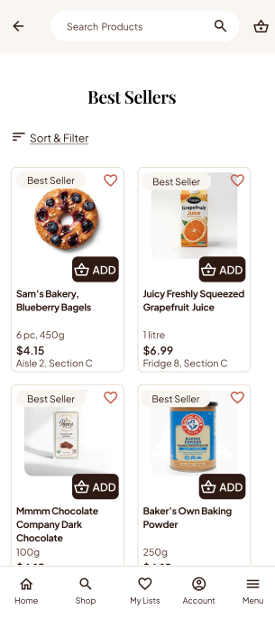
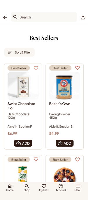
2: Enhancing Visuals & Interaction
The Challenge
Users reported that the product listing pages felt “visually dense,” causing cognitive fatigue. Specifically, the “Add to Cart” button, initially designed as a subtle overlay on product imagery, lacked the necessary contrast to be instantly recognizable.
The Strategic Pivot
We implemented a design system overhaul focused on Visual Hygiene and Interaction Clarity:
Breathing Room: We introduced consistent padding and whitespace around product cards, allowing users to scan the interface without the clutter of competing elements.
Prominent Call-to-Action: The “Add to Cart” function was decoupled from the imagery and given its own high-contrast space, ensuring the primary conversion point is unmistakable at a glance.
Readable Typography: By optimizing font hierarchies, we transformed a dense category view into a clean, scannable, and highly readable experience.
3: Decentralizing Wayfinding
The Challenge
Initially, the map was treated as a “destination”, it was hidden behind the shopping list workflow. Users were required to add items to a list before they could even access the wayfinding map. This created a high barrier to entry for quick, in-store queries.
The Strategic Pivot
We transitioned from a “Workflow-Dependent” map to a “Global Utility” model.
Direct Access: We introduced an “Item Finder” icon on the homepage, allowing users to initiate a search independent of their active shopping list.
On-Demand Location: The map now functions as a standalone navigation tool, enabling users to locate any product in the store at any time, even if they aren’t actively shopping or using a list.
The Result: By “decoupling” wayfinding from list management, we empowered users to use the app as a spontaneous retail assistant. The map moved from a rigid step in a process to an always-available, high-utility feature.
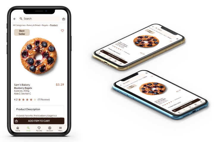
High-Fidelity UI:
Bringing Solutions to Life
The final design phase focused on translating our strategic interventions into a polished, high-fidelity interface. We prioritized visual clarity and interaction affordance, ensuring the UI facilitates, rather than complicates the user’s shopping experience.
1: Solving In-Store Navigation
The Challenge
Users reported “time poverty” in the grocery aisle, an excessive amount of time spent searching for items rather than completing their shop. Unoptimized store paths led to backtracking, frustration, and overall inefficient grocery logistics.
The Strategic Pivot
We reimagined the physical store as a data-driven path. By decoupling wayfinding from the list management workflow, we created a tool that acts as a real-time shopping assistant.
Aisle-Based Optimization: A sorting engine that sequences the shopping list by physical store layout, turning a chaotic list into an optimized, linear route.
Interactive Spatial Wayfinding: An on-demand, touch-interactive map that provides an immediate birds-eye view of item proximity, eliminating guess-work.
Voice-Activated Guidance: Hands-free, audio-cued location prompts for seamless navigation while managing a shopping cart.
2: Eliminating Meal Planning Friction
The Challenge
For many users, the “grocery cycle” begins with the burden of decision-making. Planning weekly meals, checking pantries, and translating those plans into ingredients is a manual, high-friction process that leads to burnout and impulse buying.
The Strategic Pivot
We transitioned the app from a simple “list builder” to an “Intent-Based Planning Engine.” By integrating curated recipes directly into the workflow, we removed the mental overhead of meal planning.
Recipe-to-Cart Logic: Users can explore weekly curated meal plans and add all necessary ingredients to their cart with a single tap. This guarantees intent-based shopping, you know exactly what you’re making and exactly what you need.
Smart Logistics: Once a plan is selected, users can seamlessly toggle between Pick-up or Delivery options, ensuring the service model matches their weekly schedule.
Predictive Re-Ordering: To further reduce cognitive load, meal plans can be set to “Recurring,” automating the replenishment of kitchen staples.
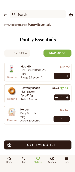
3: Synchronizing Fragmented Logistics
The Challenge
Users often suffer from “logistical redundancy.” When shopping lists are siloed from inventory, meal plans, and actual pantry needs, the result is excessive trips to the store, unnecessary spending, and time wasted on backtracking.
The Strategic Pivot
We moved away from isolated lists and created a “Unified Inventory Ecosystem.” The app acts as a single source of truth, synchronizing user habits, recurring needs, and real-time store availability.
Curated List Segmentation: Users can create distinct, purpose-driven lists (e.g., Pantry Essentials, Monthly Staples, Weekly Perishables), allowing for a highly organized shopping intent.
Intelligent Fulfillment: With one-tap “Quick Re-order” and automated delivery scheduling, the system handles the replenishment of essentials before the user even realizes they are low.
Fluid Transitioning: We bridge the gap between digital planning and physical shopping. Users can transition from a saved list to the Spatial Wayfinding Map with a single tap, ensuring that whether they choose delivery or in-person shopping, the process remains frictionless.
4: Curating Financial Intent
The Challenge
Digital grocery interfaces are often engineered to trigger impulse purchases, leading to budget creep and cluttered pantries. The lack of organization forces the user into a reactive shopping mode, where convenience comes at the cost of fiscal control.
The Strategic Pivot
We re-oriented the shopping experience from Reactive Consumption to Intentional Procurement. Every feature—from organization to automation—is designed to help the user regain control over their household budget.
Intentional Navigation: By providing clear, aisle-specific wayfinding, we minimize the time a user spends wandering, which naturally reduces exposure to impulse-driven marketing displays.
Streamlined Discovery: We replaced generic browsing with high-intent shortcuts: Weekly Deals, Best Sellers, and Quick Re-Order. This allows users to find what they need, at the price they expect, without the distraction of algorithmic noise.
Automated Fiscal Discipline: By empowering users to plan meals, manage inventory, and automate recurring orders, the app transforms grocery shopping from a chaotic expense into a predictable, budgeted household service.